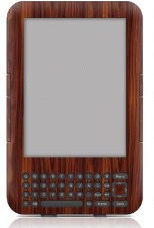
 A few weeks ago I proofed the “galleys” — the old term still has to apply, I guess — for the e-book edition of Mortality Bridge. I received them in epub format from the publisher and used Calibre to convert it to MobiPocket for my Kindle (which my friend Scott gave me some time back). I was startled at the limitations of this brave new form.
Let me back up a second to say that I’m no analog era holdover being dragged kicking and screaming into the digital age. I have quite the digital presence, thank you very much. In addition to traditional writing classes and readings & suchlike, I give a decent amount of talks about digital media and intellectual property, mostly to writers over 40 or 50 who are nervous about all this new stuff. (It’s a totally unnecessary speech to anyone under 35.)
I’m not someone who loves books just because they’re books. I do love them as objects of art: the whole art-directed package can be quite beautiful as well as practical and convenient. But if the printed book were not practical as a device, it would not have lasted so long, and the truth is that it has retained essentially the same form for about 600 years because, until the advent of digital media, it was hard to even conceive how to improve on it.
Enter e-readers. E-books have been around a good 10 to 15 years longer than e-readers, but they mostly existed for use on personal computers and not on handheld devices, and it turns out most people don’t like reading novels at their PC. Quelle surprise. When the advent of portable e-readers (spurred by Amazon’s Kindle) liberated the medium from the desktop, the deluge of releases soon followed. This last year saw paperback sales taking a back seat to e-book sales for the first time.
If you regard the printed book as a device, it’s silly to insist on holding onto it when a superior device comes along. Or even an equivalent device that is much more portable. (Think you’re loyal to your printed library? Wait till next time you move to a new house and realize you could have transported all your books by putting your e-reader in your pocket.)
After dealing with the galleys of Mortality Bridge, I have to say that this superior device isn’t yet here.

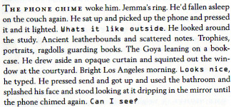
For one thing, E-readers can’t change font. If I want to display a handwritten font for a note, or something that looks like an SMS text, or want to go from Times Roman to Helvetica (for a Q & A, for example), or switch to Courier to go to screenplay format for some effect or other — tough shit. I can have italics and boldface. Mortality Bridge is full of handwritten notes, SMS fonts, Helvetica road signs, small-capped dialogue with nonhuman creatures. Too bad, baby.

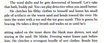
You can’t control space breaks on an e-reader, only hard page breaks. This is because the software formats the text on the fly for the screen size and to accommodate the text size the reader has chosen (more on that later). So you end up with the ugliness of orphans that end sections (words that sit there by themselves on a page before a hard break). Or breaks that occur at the bottom of the screen and resume at the top of the next screen, with the reader unaware there was a break unless you either put in three askterisks or cap the first few words in the next section.No big deal, right? But Mortality Bridge has several sections that break mid-line and resume after a break to indicate an amnesiac interval. When one of those breaks at the bottom of a screen and resumes at the top, it’s just confusing. And the publisher has no control over how this occurs.

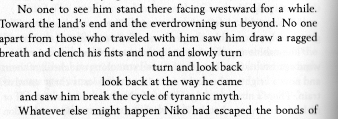
Spacing is another issue. If you play any typographic games, you’re mostly S O L. One section in Mortality Bridge was laboriously worked on to right-align under a partricular word to heighten a dramatic effect. The typesetters at Subterranean were wonderful in working with me to achieve this. Now comes e-book time: sorry, no way. The best you can do is indent the lines.

In-text graphics are another issue. Mortality Bridge has a few — arrows on road signs, down buttons on an elevator. That’s a big no-can-do on your e-book, good buddy.
Line breaks can’t be controlled. Mortality Bridge opens with a poem by Mark Strand. Poets work very hard on line breaks. E-books don’t give a shit if you want to keep certain blocks of text together and they won’t let you control the size of the text for the epigraph. Not only can you not change the size within the text, but the reader can change the size to anything he wants anyhow. The best you can do is force a line break and indent the remainder to indicate its original intent as part of the original line. It’s not the end of the world, but it’s not satisfactory, either.

Part 2 tomorrow.
I don’t know what kind of conversations you’ve had with your publisher but it seems like some of this should be possible, given what I have seen in other ebooks. On the other hand, when converting using Calibre, the program is just making a best guess as to how to preserve formatting, which is why a lot of that stuff might have been lost.
The layout issues are innate and not a result of Calibre conversion. I’ve had lengthy back-and-forth exchanges and worked extensively with the layout person for the Mortality Bridge e-book. It didn’t even occur to me that these issues would exist when the e-book for Elegy Beach came out, and I didn’t work with my publisher on that. To be honest I haven’t read the Elegy Beach e-book and now I’m a bit leery to.
I’m sure the issues differ among the e-readers. I imagine e-books on the iPad have more sophisticated formatting options.
But my point here is simply that e-books have yet to equal what print books offer in terms of design and what is conveyed through that, and have only rudimentarily begun to take advantage of the capabilities that they do possess as digital a digital medium.
I recently went through the process of turning my wee ebook to an EPUB that Apple was willing to accept. I’d originally converted from HTML to EPUB with Calibre, and while the resultant file did play nicely with my iPad, it didn’t play nicely with iTunes Producer. I resorted to using Pages and reformatting everything to fit their ‘best practices’ layout and the resultant file was uploaded without incident. (Hasn’t shown up in the iTunes Bookstore yet, but do stay tuned.) It looked . . . acceptable, at least, and my main goal was to get the thing out there for the world to see.
But, yes, believe me, I understand how frustrating it can be to deal with your words getting mangled in the thresher of ebook conversion. Hopefully next go-round I’ll have a better idea of what will work and what will not and plan the coding accordingly.
You shouldn’t oughta tole me that — I’m planning on bringing some stuff out in the next year, and guess whose poor widdle bwain I’m gonna squeeze dwy?
Is this the one that’s out on Amazon now? Did you have to format it separately for iTunes? That would suuuuck — and also kind of reinforce the point I’m making with this post.
My brain probably isn’t worth squeezing dry in that department, to be honest. I have a lot to learn, myself.
Yes, it’s the one on Amazon and yes, I had to format it separately for iTunes. Amazon uses MOBI and iTunes uses EPUB so there’s really no way to avoid that. (You’ll also need two different ISBNs for ’em, as well.) The TOC thing just about gave me fits because I was coding the thing in HTML and converting with Calibre and my test runs forced me to fork the code to do the TOC two different ways that would work on each reader.
Coincidentally, I just saw this today: http://feedproxy.google.com/~r/Techcrunch/~3/pafOPIckCUg/ – maybe it’s worth holding off on the kindle release until these features are in place?
Big love, fus
Those bastards are only doing that to invalidate my post.
Funny, at the end of part 2 I give it five years at the outside before everything I’m bitching about is resolved regarding e-books. It looks as if it will be a great deal sooner than that. Which would be swell with me.
Thanks, Rufus!
No worries, was just reading a bit more about this on the amazon website, it looks at least like you’ll be able to publish now, and then update to the new format when it’s released. How this affects people who’ve already purchased the book, I’m not sure – I assume that their kindle/app will automatically download the new version when it’s updated on the store. From the site :
Q: Will my existing Mobi files still work on Kindle e-ink devices and apps?
A: Yes. All currently supported content will continue to work. Information on how to update your existing titles to take advantage of new capabilities in KF8 will be in the new Kindle Publishing Guidelines, available soon.
(A bit late but I’ll venture a reply)
As Joel mentioned, most of what you’re wishing for in parts 1 & 2 is doable.
ePub is basically HTML with some images/fonts in a zip file, so anything that you can do on a webpage, you can have on an ePub “page” — and the same goes for the new Kindle format.
1. ePub supports bundling custom fonts, so you can have things look however you want, and things like small-caps are a simple matter of CSS. Two ways of achieving it is with “font-variant: small-caps;” (which takes care having “A” and “a” appear as differently-sized capitals) or a simpler font-size: 70%”.
2. In-line images are also not a problem. If you really want things to look good, you can use “image” fonts ala wingdings to get the images to scale nicely with the text.
3. You can force lines not to break, but then some e-readers with narrow screens will cut-off the text (there are usually no scrollbars on such devices.)
4. While each ebook has to have a “Table of Contents” and the browsing program will call it that, you can still have an actual table of contents page in the text, and give it the title CANTOS and whatever else you want.
5. Line-breaks are hard. 🙂
6. Poems are hard, especially indenting things mid-paragraph 🙂
7. Images are also hard. They’re usually too small because the e-reader screen is usually smalls. And publishers don’t care enough to supply high-resolution images.
8. In the case of Mechanique, according to the Amazon Kindle preview, it seems some of the fonts weren’t used, which seems to detract from the steampunk quality 🙁
If all else fails, you can always publish a PDF. But then IMO the only people who will enjoy it are those with an iPad. It’s unpractical for small-screen devices.
Formatting an ebook takes a bit of effort (not unlike “traditional”, fixed-size layout formatting.) Usually, most of the problems you’ll find in e-books online are due to inattention on the part of publishers. Books can be full of typos because they’ve been OCRed, or because the ebook has been made from a non-proofed draft that is different than the print edition. They can be fine, except for random hyphenation that’s left-over from the print book. Sometimes no attention is given to how to handle footnotes.
If you’re interested in assistance producing something awesome, check out http://threepress.org/ — they’re actively participating in the ePub standards effort, develop some open-source tools for the community, and are always trying new experiments to see what’s possible with ebooks. I think they’ll be happy to help. (I’m unaffiliated. I just want better-quality ebooks 🙂