One of the many great things about my experience with Subterranean Press regarding the publication of Mortality Bridge was the cover. Bill Schafer, Subterrranean’s publisher, asked me to submit cover ideas. That alone was pretty damned cool, as writers don’t get asked that very often. (To be honest, that’s usually a good idea. One look at most writers’ website designs is enough to verify this.)
I can’t draw worth a damn, but I’ve done a bunch of graphic design work, and I worked in advertising for years (something I’m glad to have done, and even more glad to be no longer doing). Thank goodness that the spiffy magic of photo editing & illustration tools helps make up for a lack of drawing ability. I hunted around online for images I could composite, and I turned in two rough concepts:
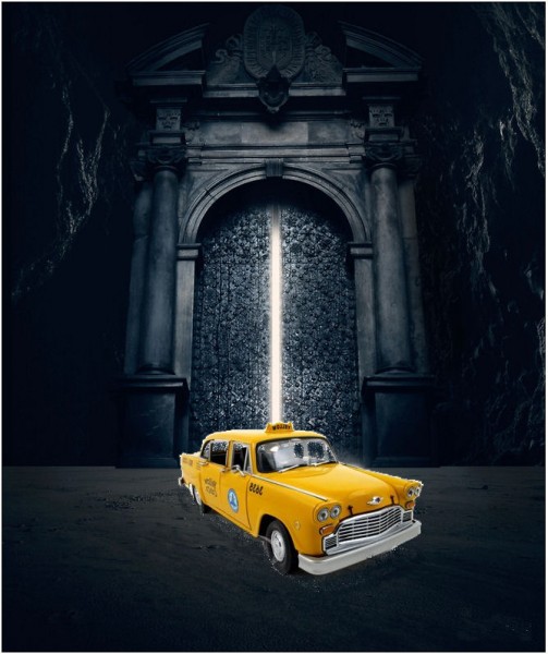
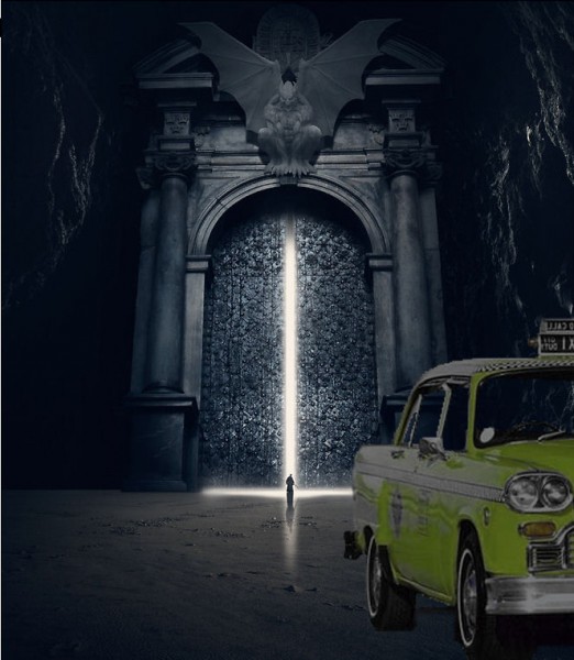
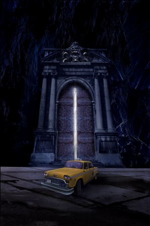
And cover artist (and horror icon) J.K. Potter turned in this cover, which shows you what can happen when a real artist gets hold of an idea:
For the e-book & softcover, I was again asked to submit ideas. (Yay!) Conceptually, it was really just going to be a reiteration of the hardcover image. I set a die-cast Checker Cab and a plaster gargoyle in front of a textured wall and took a bunch of pictures. I picked one I liked:
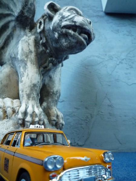
Then I made a ton of changes to it. I matched light sources & shadows’ replaced the wall with a rock cliff background and color-matched that; added a tunnel, shading, and rocky ground, and beat up the Checker Cab. (I use Paint Shop Pro X, which should make the spine of any professional designer curl like a question mark.) This is what I ended up with:
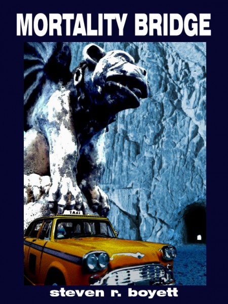
I really like it, and it’s a total failure. As an image I think it’s intriguing. As a design — blecck. Everything’s happening on the left side. Your eye goes straight to that huge flat blank space of cliff wall formed by the crescent of the inside edge of the gargoyle and the top right of the cab. Even worse, there’s no way to design around it. Putting the title in that space is hideous (trust me on this). Moving the elements around destroys the idea or makes it confusing. Wahhh.
I worked with the cover designer to see if we could preserve the idea, but any kind of monster or statue proved hugely distracting. A taxi cab parked in front of the gate of hell is really intriguing. It poses all kinds of questions and implications. Put a monster in it and you totally lose that. So we worked on keeping the feel while emulating the hardcover. This was the final result:
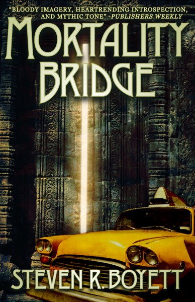
I thought it was okay, but then I got the actual softcovers, and I thought it looked great. There’s still a blank space, but the artist made use of it by pumping up that white line of partly opened door, so that your eye follows it straight down from nicely art nouveau title to the cab.
Every book cover is a problem that someone found a solution for. The number of solutions is vast. I find this stuff fascinating for the same reasons I’m interested in logo design: How do you convey an idea, a story, a reputation, a service, in a simple and easily understood image? Art directors at major publishers have to do this dozens of times a month.
Thanks for sharing. I thought the art for the hardcover edition was awesome. That white light coming from the barely open gates is all I saw in my head towards the end of the book and you guys really nailed it on the cover. I would have liked the standing figure you had on your version be brought over though.
I just finished my copy of MB last night (Book #667. So close!) I really loved it, what a fucking ride! Thanks again for another great story. Looking forward to the next one. Salud!
Andres– I’m glad you like the cover! I’m delighted to have a JK Potter cover; he’s a legend in horror & cover illustration. Though we didn’t talk about why we didn’t go with the silhouetted figure in the doorway, my instinct is that what pulls you in with this cover is the juxtaposition of yellow Checker Cab and gate of hell. It’s almost like a Magritte painting; your first reaction is, I’ll bet there’s a story there. I could almost have written the novel based on the cover.
Thanks so much for getting Mortality Bridge! An old college friend of mine ended up with copy #666. FWIW, I was jealous too. 🙂 Think of yours as the number of the Beast’s older brother.